
Förhandlings- och samverkansrådet PTK
During the end of 2018 and the beginning of 2019 I’ve worked closely with PTK and agency AFFAIRS to create illustration and animation guidelines for PTK to use both online and in printed material. PTK has an important role in many industries, serving guideance and education to 27 different unions across many fields. Naturally much of their content relies heavily on graphs and numbers. The biggest challenge was to create a toolbox that could present data and graphs in a pleasing way without creating speedbump in the process. The project has been extremly fun and rewarding and I think it really shows in the end result.
Client - PTK // Agency - AFFAIRS // Art Direction - Marjukka Anthony at PTK, Patrik Bescow at AFFAIRS // Illustration & animation - Lage Lind // Project Manager - Benkt Wästlund at PTK, Antonia Von Euler at PTK

Cover photo for PTK:s social media platforms
Creating a toolbox with a scalable design
In order to make the guidelines easy to use and scalable to fit every situation, we created a toolbox containing over 60 different illustrations and characters. The idea is for this toolbox to keep growing as more custom illustrations and animations are created for different purposes. A big challenge was to find the balance between playfulness and authority. PTK:s role for their members is to keep an eye on important stuff, like union negotiations, education and pensions, but does so with a human and kind touch. We wanted the illustrations to enhance that.

Some of the illustrations created for the toolbox

The result - design that is scalable to fit the situation, from calmer to more intense.
Patterns and dividers
PTK:s main use for illustrations is a larger publication existing both in digital and printed form. We created many different patterns and compositions that could serve both as a playful injection of colors in the cover of publications, but also as dividers between chapters. These patterns were created in two different executions - one being more calm and authoritarian and the other more playful.

A selection of chapter dividers

An upscaled illustration used as a pattern for the frontpage
Characters
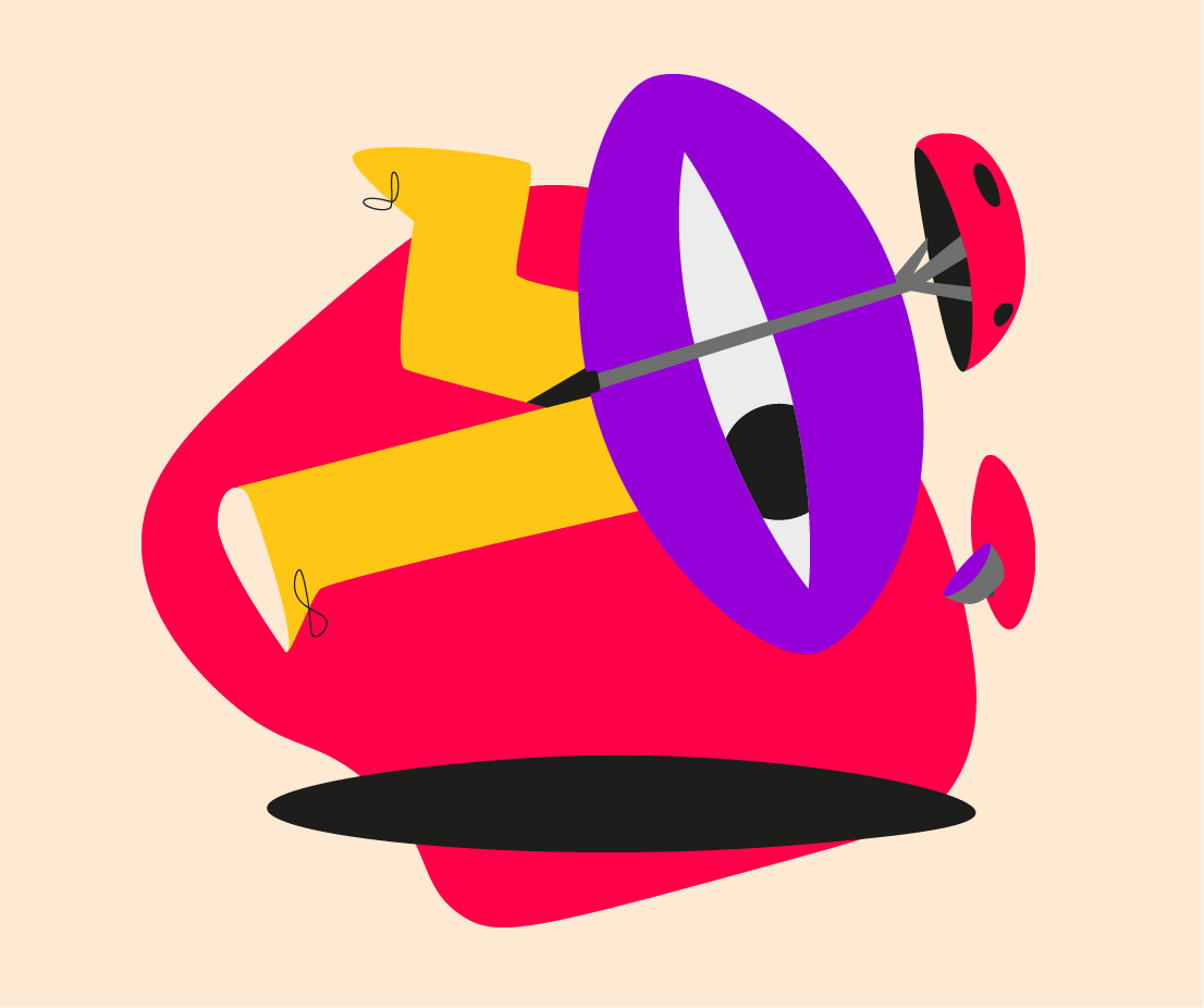
The characters have a central role in PTK:s profile - working with topics that can have a great importance in peoples lives, like pensions and union agreements. A requirement was to have the characters feel human and warm, yet be completely diverse in terms of gender and ethnic background. It was a challenge, but we came up with the concept of building all characters around an eye - something that is the same regardless of who you are and where you come from. From that, we started building a library of characters in different situations in life, resulting in more than 20 different characters.

A selection of some of the 20+ character created over the course of the project.
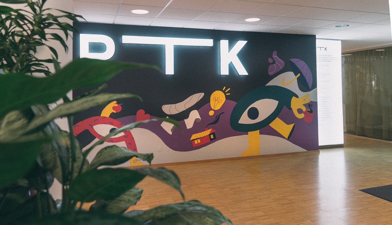
Some of them even made it on to the wall at PTK HQ, painted by Amanda Senneby
The canvas
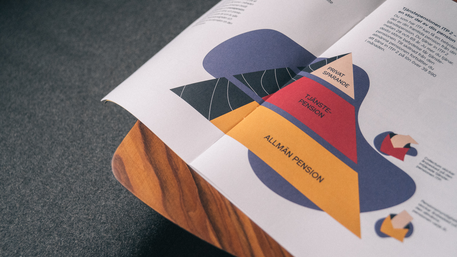
A slab of paint keeping it all together. The canvas is simple and easy to use and serves it purpous well - connecting all the illustrations into a uniform viewing experience. The canvas is used togheter with either a character or a simple graph to create a unit that is easier to place as an editorial piece. It’s also a great way to add some color to graphs. Take a graph and put it on a canvas, add a fitting illustration from the toolbox and you’re done!

Bringing it to life
We had created all these wonderful characters and a massive toolbox for PTK to use. The next step was to create a simple guide on how they all should move and appear in animation. With limited time we had to focus on the most useful aspects to cover in order to create a guideline that would direct but not limit animators. We chose to cover things like easing of keyframes and creating keywords to direct the animation to align with PTK’s brand story. We dipped breefly in to what we felt were the most important principles of animation to take in to account when animating these characters.
Something challenging was giving these characters different facial expressions and expressing emotion. The only facial feature to work with is the eye and shape of the body - but that’s plenty enough. Using old tricks you are able to express a full range of emotions by changing the shape of the of th eye and using exaggerated body language.

The characters can be a challenge to animate - their strange appearance and missing limbs makes them daunting to animate at first glance. But when using the right character for the right job, the process is simple. Some of the characters lend themselves to bigger movements - like walking and bicycling, while others are more suited for smaller movements.


The graphs are a big part of PTK’s printed and web material and the same applies to their motion productions. A graph is simple to animate - but we can easily add some flare with an animated canvas. Add a character from the toolbox with a smaller movement and you have something that’s not intruding on the information but still brings a little more joy to the eye of the viewer.
